_October2013_small-c5284e74ed9ef79f612813617b47061d92bf282e0f0f8ff07179efcb1aa8cc1a.jpg)
|
Research & Analysis for Business and Investment Clients |
|
Home
|
Research
|
Mission
|
Interaction Process
|
Firm History
|
Contact Onyx
|
FAQ
|
Quality Content
Net Worth Probability Distribution Graph – United States
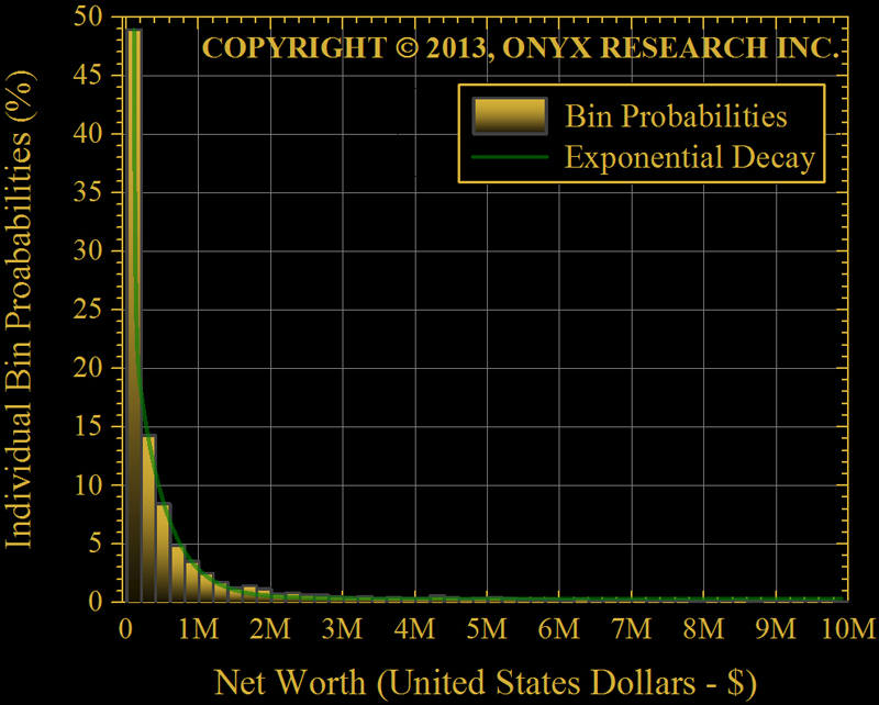
A great way to visually understand how net worth is distributed is by plotting net worth probability vs. net worth. As you would expect there are many households with moderate net worth and a few with very high net worth. To undertand the data a histogram is plotted in the figure above. This graph shows what percentage of US households fall into specific net worth bins. For example, just over 3% of American households have a net worth between $800k-$1M.

Custom Search