_October2013_small-c5284e74ed9ef79f612813617b47061d92bf282e0f0f8ff07179efcb1aa8cc1a.jpg)
|
Research & Analysis for Business and Investment Clients |
|
As new data emerge it will be interesting to see how emissions growth changed during the recent economic downturn.
Emissions by Country — United States, China, India, South Korea, Iran, & Iraq
United States CO2 emissions from 1850 on are plotted in Figure 4. Red, green, and blue curves plot emission contributions from gas, liquid, and solid fuels. Curves indicate the United States is heavily dependent on solid and liquid fuels, and, to lesser degree, reliant on gas phase fuels.
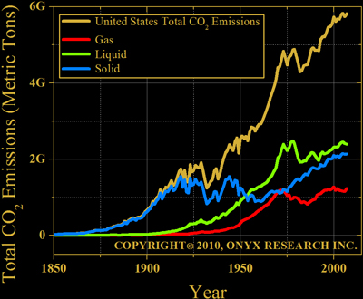 Figure 4. United States CO2 emissions. Total emissions plotted in gold. Red, green, and blue curves plot gas, liquid, and solid fuel emissions individually.
China and India have a much different fuel consumption profile. Both rely, almost exclusively, on solid fossil fuels (i.e., coal).
China's CO2 emissions from 1900 are plotted in Figure 5. Red, green, and blue curves plot emission contributions from gas, liquid, and solid fuels. Curves indicate China is heavily dependent on solid fuels with growing liquid fuel consumption.
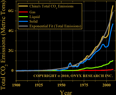 Figure 5. China's CO2 emissions. Total emissions plotted in gold. Red, green, and blue curves plot gas, liquid, and solid fuel emissions individually. Gray curve fits an exponential growth curve to gold curve data.
Exponential growth numbers are consolidated in a table on page 3.

India's fossil fuel emission profile is plotted in Figure 6. Compared with the United States and China, India's emission curves are remarkably smooth. With impressive coal supplies, little societal unrest, and a democratic government, exponential growth should continue.
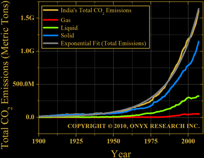 Figure 6. India's CO2 emissions. Total emissions plotted in gold. Red, green, and blue curves plot gas, liquid, and solid fuel emissions individually. Gray curve fits an exponential growth curve to gold curve data.
South Korea's CO2 emissions from 1950 on are plotted in Figure 7. Red, green, and blue curves plot emission contributions from gas, liquid, and solid fuels.
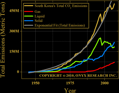 Figure 7. South Korea's CO2 emissions. Total emissions plotted in gold. Red, green, and blue curves plot gas, liquid, and solid fuel emissions individually. Gray curve fits an exponential growth curve to gold curve data.
